Building and delivering products often draws parallels to my passion for sushi — balancing precision, creativity, and thoughtfulness. As a UX designer, product manager, and self-professed sushi fanatic, I’ve always found myself drawn to analysing everyday digital experiences, even while waiting for my food. The Sushi Tei app, a tool I frequently use for ordering at one of my favourite restaurants, is no exception.
This review isn’t definitive, as design is always subjective. I might very well be in the minority with my views, but here are my observations — a mix of appreciation and suggestions — on the Sushi Tei app.
What Works Well
- Reinforcing Japanese Sushi Terms
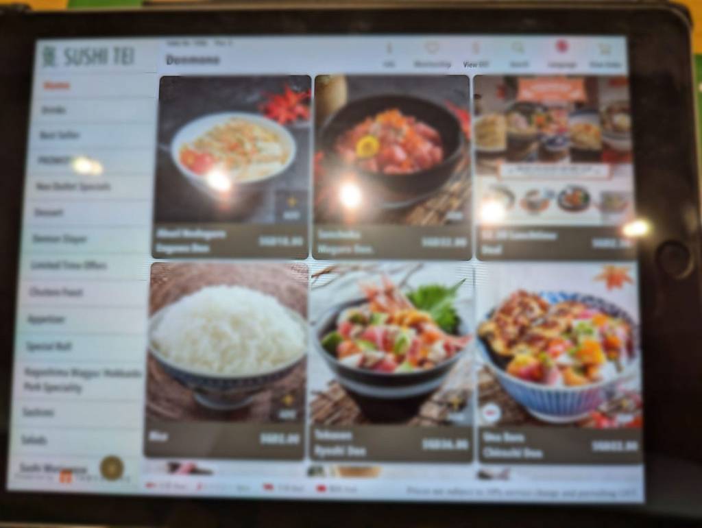
One thing the app consistently does well is reinforcing Japanese terminology. Every time I use it, I’m reminded of terms for different types of sushi — ones I’d likely forget otherwise. As a sushi enthusiast, this appeals to me, but I can’t help wondering how daunting this might feel for someone less familiar with Japanese cuisine. - Appetite-Stimulating Visuals
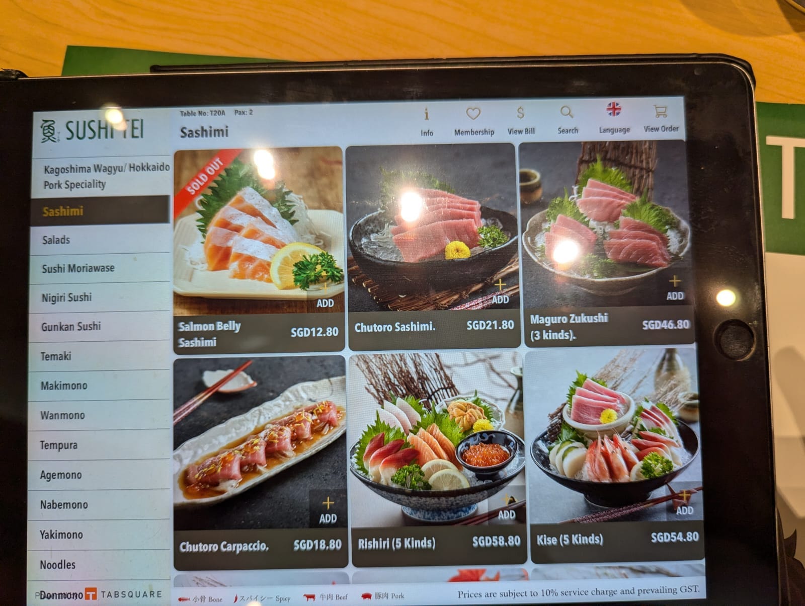
The visuals are an undeniable strength of the app. Each dish is presented with bright, uniform, and colourful images that do more than showcase the food — they make me hungrier than I probably should be! - Using Gestalt principles like proximity and similarity, the app groups items cohesively, making it easy to scan. The images are consistently sized, vibrant, and well-positioned, ensuring the menu is both functional and enticing.
- Typography and Layout
- Font Style and Size: The sans-serif font strikes a perfect balance between casual and readable, even for my “old flowery eyes.”
- Text Alignment and Line Spacing: Clear alignment and ample spacing between items make it easy to compare dish names and prices.
- Below the Fold Navigation: The app’s layout hints at more items below the fold, encouraging me to scroll further. This is a subtle yet effective design choice that invites exploration.
Where It Falls Short
- Information Architecture
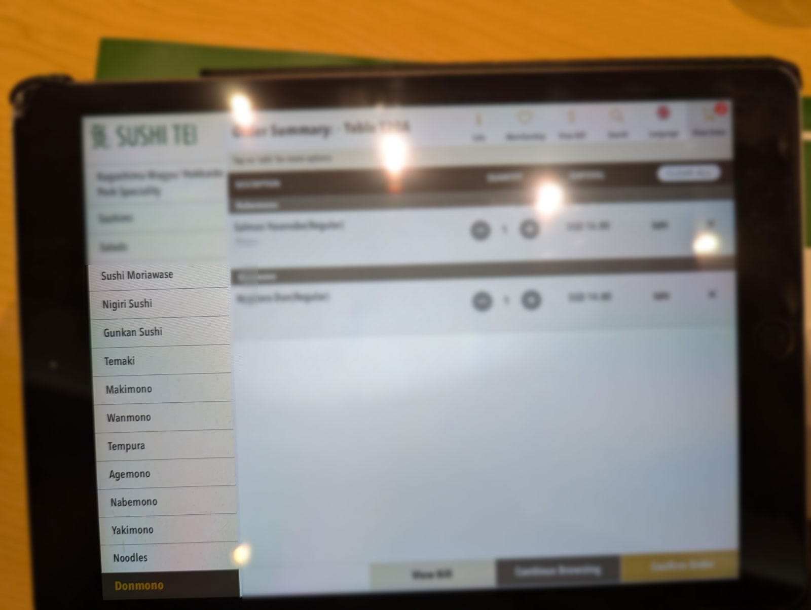
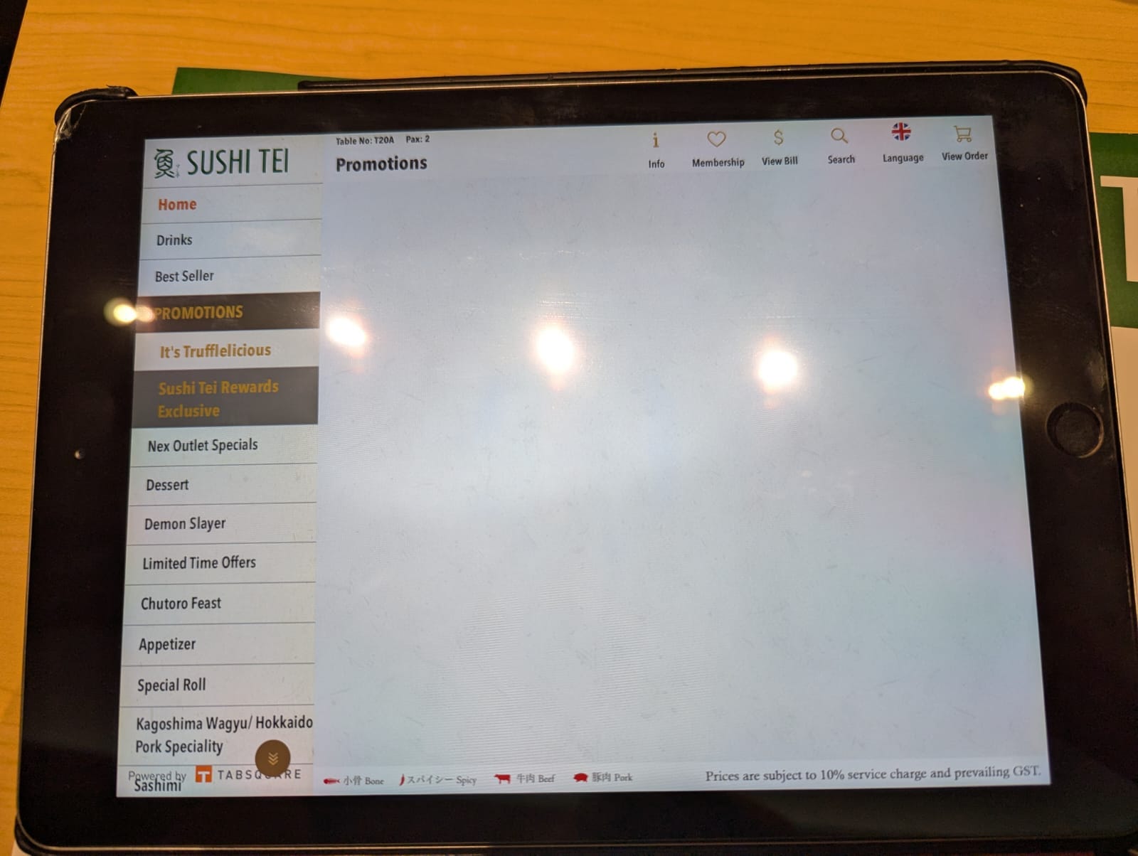
While the app’s menu structure aligns with its Japanese theme, it could benefit from better organisation. The lack of structure makes navigation feel somewhat chaotic, especially for users who are exploring the app for the first time.- The top-level menu contains about 13 additional categories, such as promotions, drinks, appetisers, and desserts. However, these categories are not alphabetically ordered, making it harder to find specific sections quickly. Dynamically reordering these categories based on logical grouping or alphabetical order could make the experience more intuitive.
- Some categories remain empty even when items are unavailable, adding unnecessary clutter to the interface. Hiding empty categories when they are not applicable would streamline the menu and reduce frustration for users.
- Navigation System
The left-hand persistent menu with a drill-down hierarchy works well overall, but it could be improved:- Too Many Levels: Some items require up to six clicks to reach, which can be tedious.
- No Shortcut to Subcategories: A multi-level navigation system allowing users to jump directly to deeper levels would save time and reduce the number of clicks needed.
- Inconsistent Image Treatment
Comparing the app with Sushi Tei’s physical menu, I noticed an inconsistency in image presentation. While seemingly minor, this inconsistency creates a subtle disconnection in the brand’s visual identity across platforms.- App Images: Rounded corners.
- Physical Menu: Sharp corners.

Unlike the app, the physical menu features sharp image corners and a cohesive visual style, highlighting an inconsistency in branding between the two formats.
4. A minor bug
- On the far-left extreme corner of the app, the branding of the app maker slightly overlaps with the last category on the menu. While this doesn’t hinder usability much, it’s a small oversight that could easily be corrected for a more polished user experience.

Final Thoughts: A Sushi Lover’s Take
Despite some room for improvement, the Sushi Tei app delivers on its primary purpose — making it easy to order food while engaging users with appetising visuals. Its strengths, like strong typography, effective Gestalt principles, and the ability to evoke hunger, outweigh its flaws.
Of course, there are areas where it could improve, like reducing the number of clicks to reach a dish or fixing that little bug in the menu. But honestly, I still enjoy using it every time I visit Sushi Tei — partly because the visuals always make me hungrier than I thought I was!
What about you? Have you used the Sushi Tei app? Did you notice anything different, or is it just me? I’d love to hear your thoughts — let’s chat while I wait for my food!
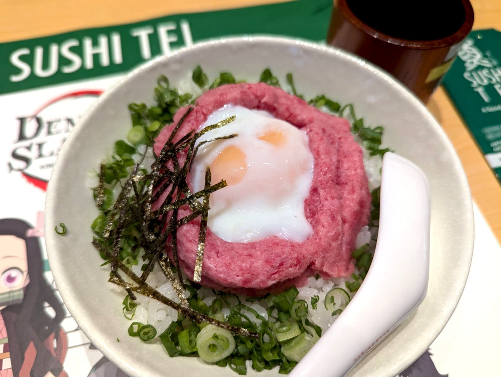
And tada, my food is here!